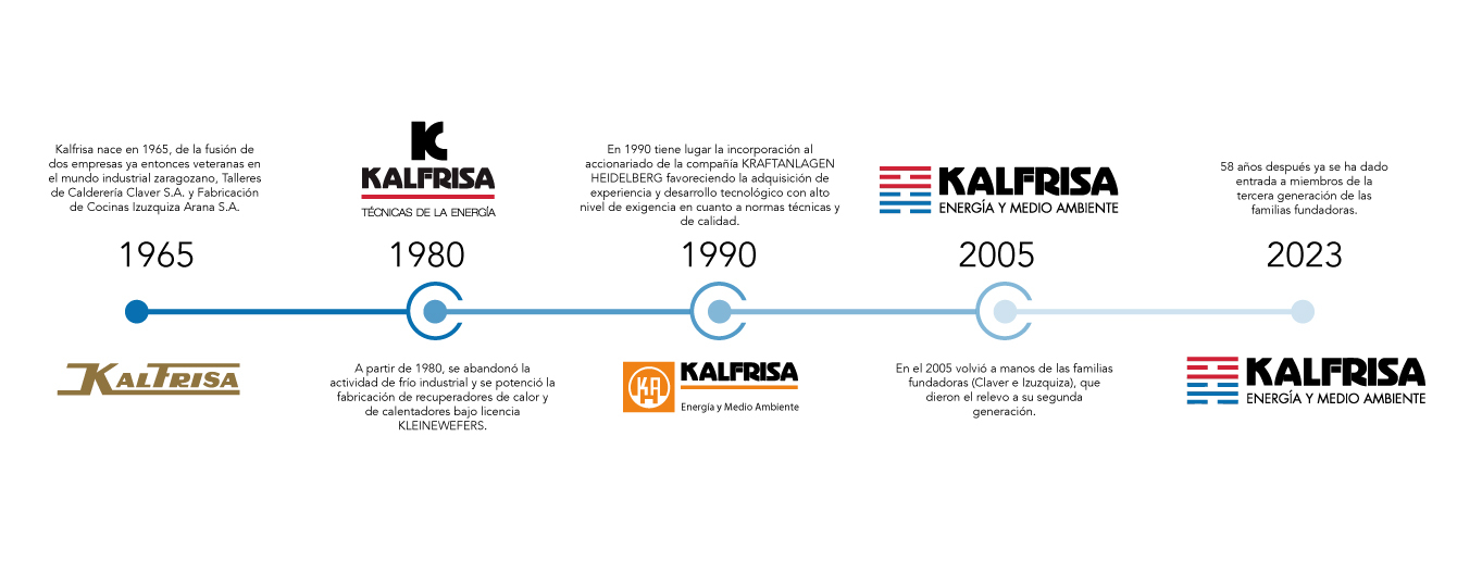
The origin of the KALFRISA brand is the union of the words HEAT and COOL.
In 1965, the company started to develop its activity in the fields of industrial heating and cooling and the manufacture of industrial kitchens.
From 1975 onwards, the industrial refrigeration business was discontinued and the production of heat recovery units and heaters under licence from KLEINEWEFERS was developed.
From 1990 onwards, we developed our industrial programme, which gained experience and technological evolution with a high level of demand in terms of technical and quality standards. Energy and Environment” already appears in the logo, coinciding with the start of installations for the thermal treatment of waste in integral plants of increasing complexity, and a specific development in the treatment and purification of waste gases through the elimination of volatile organic components is initiated.
In 2005, the company passed into the hands of the founding families who handed over to the second generation.
Maintaining Kalfrisa Energy and Environment to highlight the company’s evolution towards a concern for environmental protection and energy saving.
We also include a logo influenced by the Bagua Map, which is a tool of the ancient Chinese Feng Shui philosophy. A dashed line between two solid red lines representing Fire, the vital aspect of fame and reputation, often referred to as enlightenment. A solid line between two dashed lines in blue representing water, challenges and challenges.
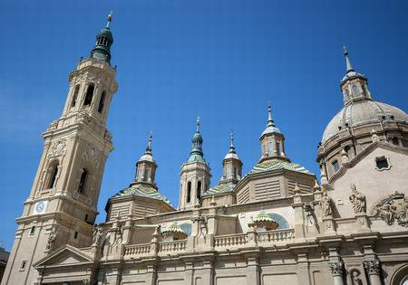
This same symbol is a nod to the design of the bricks of the towers of the Basilica of the Pilar in Zaragozuela. Basilica del Pilar in Zaragoza. a.